#1
DESIGN
WHY THE 508 IS SMALLER AND MORE PRACTICAL, AND THE SECRETS BEHIND THAT KNOCKOUT COCKPIT
Words: Phil McNamara I Photography: John Wycherley
Pierre-Paul Mattei remembers the do-or-die feeling as Peugeot began conceptualising the new 508. ‘Frappe fort! Hit hard!’ recalls the design manager. We knew we had to hit strong, to make something different, or we shouldn’t go back into the [market] segment. It was a global ambition, a conviction, from the designers to the engineers.’
And this 508 does indeed redefine the rules for the brand’s flagship saloon. In a discipline where millimetric differences are considered significant, Peugeot sliced centimetre after centimetre off its new car. The team spent 18 months honing this smaller package, assessing how every revision would impact interior space, how to accommodate key components, the occupants’ ability to see out, boot volume and access, all the while seeking dramatic proportions with real visual impact.
They milled model after model from polystyrene, slicing and refining, viewing them full-size in natural daylight alongside competitor cars to make sure they stood out. ‘The 508 needed unusual proportions,’ continues Mattei. ‘We wanted status and dynamism, though the key word was elegance. But if something is too simple, built on traditional volumes, the car will not be noticed. It will be boring.’
In this quest to stand out, the team asked searching questions. Traditional saloon or five-door fastback? Do the side windows need frames? Can Peugeot’s limits for stamping sheet metal be stretched? And why accept a dominant cliff-face dashboard? The result is a car that challenges conventions and sets new standards for Peugeot efficiency. Here are the building blocks that made it happen.
DESIGN SECRETS: SIZE AND CONCEPT
Big saloons from mainstream car makers risk going the way of the dodo, asserts Peugeot’s design director Gilles Vidal. ‘People aren’t interested in those cars, but not everyone wants an SUV. The answer is to make them evolve,’ he argues.
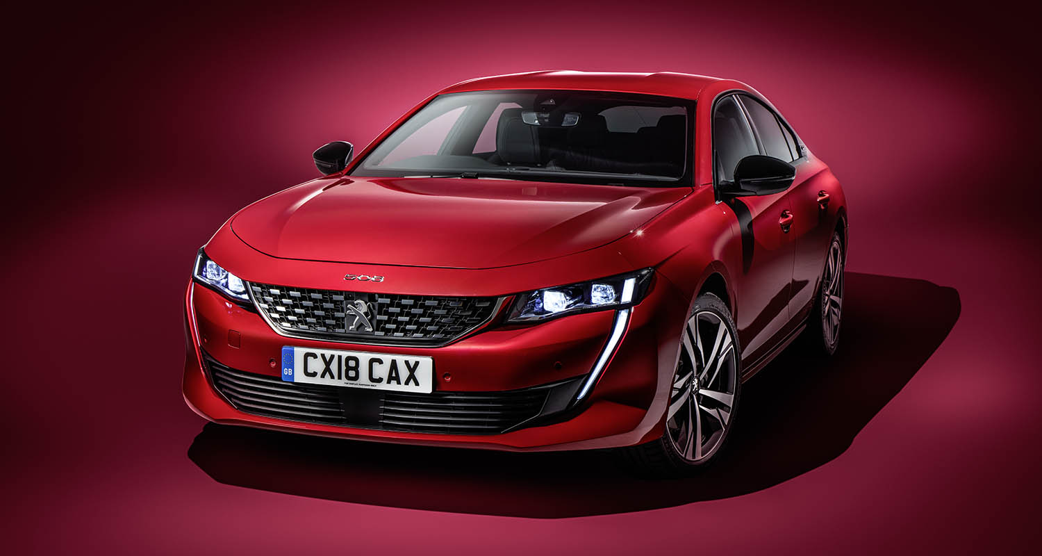
Here’s how his team did it. The new 508 is 8cm shorter than the car it replaces, an unprecedented hatchet job. That’s great for manoeuvrability and weight reduction. It also stands 6cm lower, and that’s great for imposing proportions. Lower and wider is easier on the eye. Frameless windows – more typical of classy sports cars – are crucial for lowering the roof, because ditching the frame eliminates an inch of height in one stroke. Admittedly that impacts on rear headroom, but Peugeot has made a call to trade rational practicality for a more emotional design.
Look at the profile: the windscreen has been pushed rearwards to lengthen the bonnet, adding prestige, while the alloy wheels measure 16-19 inches in diameter. And the five-door fastback’s roofline descends more elegantly and less steeply than a conventional saloon’s. Appealingly though, the 508’s design still incorporates a hint of a three-box saloon’s trunk. Not that you’ll be loading it with a croupier’s stick for pushing dice down a craps table: the hatchback ensures a big aperture, opening into 487 litres of luggage space.
DESIGN SECRETS: THE BODY PANELS
The 508’s side panel – with its shockwave of crisp creases on the rear wing – embodies the team’s desire to break new ground. When the R8 project started in 2012, Peugeot didn’t have the capability to stamp such a vast and complex swathe of sheet metal. The sticking point was the section that wraps around inside the car: the engineers feared this flap would shear as the bodyside was punched out of steel plate.
‘It’s the biggest piece the factory stamps,’ explains design director Vidal, ‘and one section folds inside the car by 16cm, maybe more. Our stamping people knew it was an amazing challenge. But they knew it existed on some Audis, which meant it was possible. Before the 508 we went maybe half as deep on our cars. Now we make one of the deepest you’ll find in the world.’
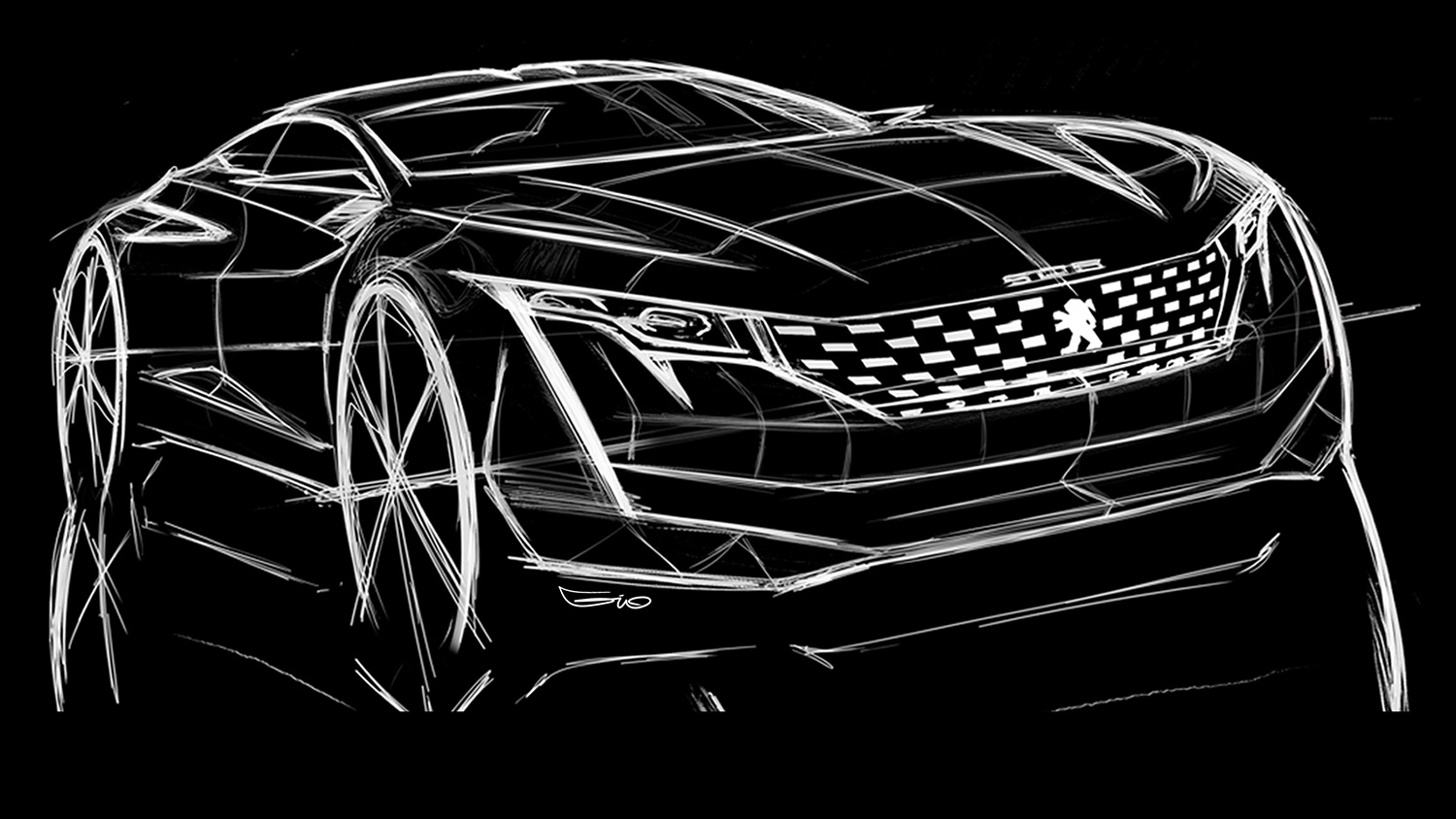
It took 18 months to sign-off the 508’s package, to make sure it was production feasible and met weight, rigidity and safety targets. ‘We pushed so hard with the engineers, we knew it would be impossible to move the structural points by even 1mm,’ says Mattei. It was then that the design competition began, to layer the details on the car. Many imaginative sketches were sunk, dashed on the rocks of those inviolable proportions.
DESIGN SECRETS: THE LAMPS
‘You must have some impact on people as soon as they see the car. We were trying to find a way to give the 508 a lot of personality and charisma, [and the solution was] those daytime running lights…’ Gilles Vidal is talking about the unusual fangs of white light that scythe through the headlamp cluster, dropping down to the lower bumper. They’re standard on the upper two trims, GT Line and GT, as is the light-catching grille with its chequer-board chrome finish. Both are set back in the nose and protected by the plastic bumper, as are the aluminium bonnet and wings, in a bid to minimise repair bills.
The rear light bar is a far more familiar design cue, but Peugeot has executed it neatly. ‘When the car is off, the tail-lights aren’t red and no graphic is visible,’ says Vidal. ‘It’s very minimalistic. But start it and all the technology wakes up.’ As you drive, a light sensor helps adapt the red glow’s intensity, so the clawmark graphic is consistently visible. The red LEDs look as if they’re floating in a block of ice, and when you open the tailgate you can peer into this 3D cube from the side: neat stuff.
DESIGN SECRETS: THE COCKPIT
The interiors of today’s Peugeots are shaped by a philosophy called i-Cockpit. The ‘i’ prefix is suggestive of Apple, and the 508 employs high-quality, smartphone-style screens. One is a digital instrument panel above the downsized steering wheel; drivers can call up six different displays, such as 3D navigation rendering nearby landmarks, digital dials, or the view from an infrared camera if Night Vision has been specified.
i-Cockpit’s final element is a central 10-inch touchscreen, with seven beautiful shortcut keys. What feels rather different is the architecture housing all this tech, because the 508’s dashboard extends in more planes than just the vertical norm.
‘Many car interiors are a vertical cliff in front of you, which seems wrong,’ asserts Gilles Vidal. ‘Something horizontal projects the same direction as the landscape you’re driving toward. Psychologically that makes a lot of sense: you’re not facing a wall.’ The shelf that juts out resembles sitting behind a roll-top desk; it’s a nice touch.
As with the exterior, Peugeot’s designers have rewritten the rulebook – and given the near-dead 508 a new lease of life as a result.


